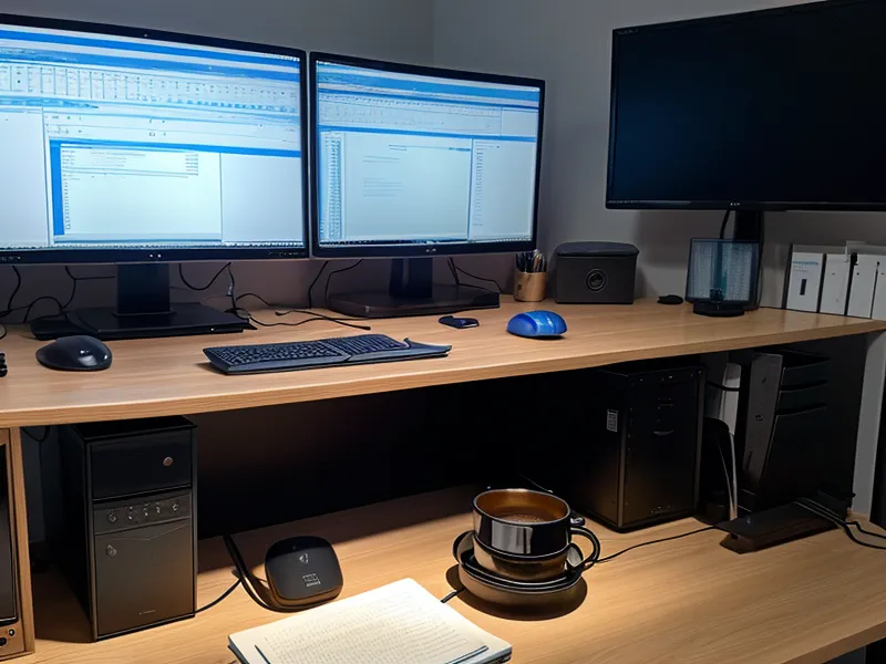
It is mid-afternoon in Austin, and the lines of JavaScript on my middle monitor are starting to vibrate. It is a familiar, unwelcome rhythm. First, the text begins to double at the edges, then the 'behind-the-eye' throb kicks in—the visual equivalent of a memory leak that finally crashes the system. I’m a 38-year-old freelance dev, and for the last few years of fully remote work, I have effectively been ruining my eyes for a living. I stare at three monitors for eight to ten hours a day, and by the time the sun starts dipping toward the Hill Country, my retinas feel like they’ve been through a paper shredder.
After a while, the sensation gets physical. It is that gritty feeling of blinking over dry eyes that feels like dragging a windshield wiper across dusty glass. I spent months thinking my blue light glasses were the fix, but they were essentially a placebo—a visual 'hello world' that did not actually solve the underlying logic errors in my environment. I finally realized that if I wanted to keep my career without needing a seeing-eye dog by forty, I needed to treat my workspace and my body like a system that needed a serious refactor. I’m not a doctor, an optometrist, or any kind of health professional. I’m just a programmer who got tired of his eyes throwing fatal exceptions every single day.
The Audit: Why My Supplement Stack Wasn't Enough
Early last January, I sat down with my master spreadsheet. I have been tracking my eye fatigue levels for over 14 months now, logging everything from screen time to supplement efficacy. At that point, I was spending mid-double digits per month on a primary stack: a high-quality Lutein and Zeaxanthin blend and an Astaxanthin extract. I was religious about the 5:1 ratio of Lutein to Zeaxanthin, aiming to bolster my macular pigment density. I figured if I fed the hardware the right nutrients, the software would run smoothly.
But the data was showing a bottleneck. Despite the supplements, my fatigue score was still averaging an 8.4 out of 10 by the end of the workday. I noticed that while the 'inner' protection was there, my external environment was still hammering my eyes with high-intensity input. I was trying to run high-performance software on hardware that was overheating because the cooling system—my office environment—was broken. I realized that managing late afternoon eye fatigue after years of remote work requires more than just popping a pill; it requires a full-stack optimization of how light actually hits your face.

The High-Contrast Trap
For years, I used the standard 'Dark+' theme in VS Code. It is the industry standard: pure white text (#FFFFFF) on a pure black background (#000000). On paper, this seems efficient. In reality, it creates an aggressive contrast ratio that is incredibly taxing for the eye to process for eight hours straight. By mid-afternoon, this high contrast leads to involuntary squinting. The skin at the corners of my eyes would feel tight and hot, like I was trying to read a flashlight in a dark room.
I realized that while standard accessibility guidelines recommend high contrast for readability, they do not account for the 'halation' effect. That is when bright white text 'bleeds' into a black background on a high-nit monitor, causing the eye to struggle to find the edges of the characters. I have written before about how I have been seeing the best astaxanthin benefits for programmers dealing with screen fatigue, but even the best antioxidant support can’t keep up if you are essentially staring at a neon sign all day.
The irony of my life is that I spend my mornings optimizing code for performance while simultaneously redlining my visual system until it breaks. I am a spreadsheet nerd, so I started logging the specific hex codes that triggered the fastest fatigue. I found that the 'pure black' themes were the worst offenders because they forced my pupils to dilate to take in the darkness while the tiny white letters were simultaneously blasting my retinas. It was a constant tug-of-war for my iris muscles.
The Redesign: 7.5:1 is the Sweet Spot
A few months ago, around late February, I decided to 'refactor' my IDE’s color palette. I moved away from the stark black-and-white world and moved toward a palette that mimicked aged paper or a high-end e-ink display. I settled on a redesigned contrast ratio of roughly 7.5:1. This involved switching to a soft gray text (#B0B0B0) on a deep navy, slightly desaturated background (#1A1B26). It was like switching from a high-pitched alarm to a low hum.

The difference was immediate. It felt like my eyes finally stopped 'shouting.' Here is how I broke down the optimization:
- Reduced Luminance: By dropping the white point of the text, I reduced the sheer amount of 'raw light' hitting my macula.
- Warmth Shift: I moved the syntax highlighting toward the warmer end of the spectrum—less electric blue, more muted gold and sage green.
- Ambient Sync: I matched my monitor brightness to the ambient light in my Austin home office, which involves a lot of indirect sunlight.
I even noticed that when I was using this lower-contrast setup, my eye fatigue spreadsheet started showing a correlation between lower contrast and longer 'focus windows' before the first headache appeared. It turns out that 'Dark Mode' isn't a silver bullet if the contrast is set to maximum. Sometimes I still deal with that dry, scratchy sensation, and I’ve had to weigh the pros and cons of preservative free eye drops vs supplements for chronic screen fatigue to keep the surface of my eyes from feeling like sandpaper, but the IDE change was the biggest structural win.
The Results: Data Review from the Last Quarter
By mid-April, I had enough data to confirm the 'patch' was working. My average daily eye fatigue score had dropped from an 8.4 in December to a 3.2. That is a massive improvement in my daily quality of life. I wasn't just working longer; I was working without the dread of that 3 PM wall hitting me like a freight train. I stopped having to close my eyes for ten minutes every hour just to reset my focus.
The process of testing seven different supplements over the last 14 months taught me that there is no single 'undo' button for eye strain. It is a cumulative build. You have to fix the input (the screen), the hardware (the nutrients in your eyes), and the environment (the lighting). I’ve tried everything from Saffron extract to Bilberry, and while each has its place in my tracking sheet, they only work if you aren't actively sabotaging yourself with a 21:1 contrast ratio.

If you’re a dev staring at a high-contrast screen and wondering why your eyes feel like they’re being sandpapered by the time you're pushing your final commit, try lowering your contrast. You don't need pure white on pure black. Your retinas aren't designed for that level of dynamic range for ten hours a day. Think of it as optimizing your visual bandwidth—the less energy your brain spends trying to resolve high-contrast text, the more energy it has for actually solving the bug in your code. Please, go talk to your own eye professional before you start a supplement regime, but don't ignore the environment you're sitting in.
I’m still the guy with three monitors and a spreadsheet for every pill I take, but at least now I can see the cells in that spreadsheet without squinting. It’s a small win, but in the world of freelance dev work, a 60% reduction in pain is the best optimization I’ve ever shipped. I am still addicted to my screens, but at least now the relationship isn't quite so abusive.